This cycling off-season, I’ve been experimenting with races on the game platform Zwift. These are cute online races where your digital avatar races against other real people at the same time by connecting your bike’s power output through a stationary trainer to your computer.
These races are put on by various communities like World Bike Relief, or in my case, the Washington State Bicycling Association. Riders self-select themselves into one of four categories: A (the best), B, C, and D (the slowest). The limits for these categories are defined by your average power to weight ratio in Watts / Kilogram. In the case of the WSBA races, we have these pre-defined categories:
A: 4.0 – 5.0 w/kg
B: 3.2 – 3.9 w/kg
C: 2.5 – 3.1 w/kg
D: 1 – 2.4 w/kg
That’s all well and good, but in the latest rounds of races, there’s been some frustrated bike racers who have been disqualified out of their categories for performing a little too well, with maybe the top 25% of the C category riders putting out an average power ratio well over the 3.1 limit. This automatically disqualifies those racers from results ranking, which seems contrarian to the nature of racing in general. Isn’t the point to go fast and win?
If a racer who hovers around 3.0-3.2 w/kg in a race wants to stay in a pack of hard racers, that will push their power up high enough for disqualification. But if they upgrade to the B category, then they’ll probably never be able to compete. This predicament inspired me to see if I could redesign the categories in a more logical fashion through the use of simple data clustering.
Intro to K-Means
Clustering is a fairly simple concept from the machine learning world. In fact, human brains are well equipped to see clustering patterns in data by just looking at it.

In the picture above, we have various flowers plotted by their petal width and length. It’s pretty easy to see here that the data can be split into two groups: one in the bottom left, and one in the upper right corner. Our brains are well suited to see this easy difference. However, if we wanted to define three groups of data from this plot, it might be tougher for us to determine. Do we split the small cluster in the bottom left into two groups or the big one in the upper right? This is where the algorithm K-Means can help us.
The K-Means clustering algorithm works by randomly putting k cluster centers on the map of data, calculating the mean distance to all the data points, then moving the cluster centers in such a way as to minimize those distances.
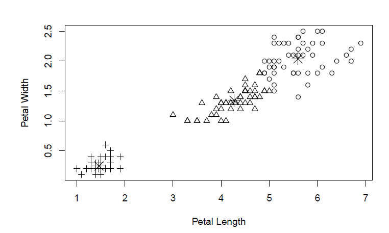
The answer according do our clustering algorithm is to split the big group, so now we have pluses in the bottom, triangles in the middle, and circles up top. This is an easy way to mathematically designate categories for groups that would be otherwise difficult to separate.
Cycling Clusters
Ok, so flowers are great, but let’s get back to cycling. I’ve collected the past 5 WSBA Zwift races worth of data for all categories and did a little bit of cleanup. You can find the raw data to download from my github account here.
We have all sorts of good info in this dataset, but we’re mostly interested in how K-Means would define w/kg power to weight ratio categories. This is a fairly straight-forward process in R:
cycling <- read.table("clipboard", sep="\t", header=T, quote="")

cdata <- data.frame(cycling$Avg.watts, cycling$est.kg)

plot(x=cdata$cycling.est.kg, y=cdata$cycling.Avg.watts)
This first code chunk shows us the overall distribution of the data for the races we've seen so far.

I’d be hard pressed to separate this data into 4 distinct categories by eyeballing it. So let’s let loose some clustering on it and see what we get:
cluster <- kmeans(cdata, 4)

cluster.table <- data.frame(cluster$centers)
cluster.table$ratio <- cluster.table$cycling.Avg.watts / cluster.table$cycling.est.kg
cluster.table <- cluster.table[order(-cluster.table$ratio),]
cluster.table$category <- seq(1:4)

plot(x=cdata$cycling.est.kg, y=cdata$cycling.Avg.watts, col=cluster$cluster)

cluster.table

The result in a nice colorized format looks like this. We can see 4 separate categories that the clustering algorithm tells us work the best. From this picture, we can see that the clusters are much more defined by the average power output (watts, or the Y axis) than they are by the rider’s weight in kilograms.
Finally, the tabular output with comparison to the old system:

According to the algorithm, it looks like the maximum bounds for the C and B categories should be upped a little bit to 3.1 w/kg for the C’s and 3.9 w/kg for the B’s. Though it seems like it would make more sense to divide the categories by average power instead, since that seems to be the more sensitive factor in the cluster splits.
Alternatively, setting the categories to be wattage-based would also work and probably be a little bit simpler. If your functional threshold power (FTP) was between 0-170, you’d be a D; 170-221 would be C; 222-270 would be B; and 270+ would be A. At least, according to the data from this particular set.
We can extend this classification analysis further and see how bad the current categorization really is:
cycling$cluster <- cluster$cluster
cycling$cluster.mapped <- cluster$cluster
cycling$cluster.mapped[cycling$cluster == 4] <- "A"
cycling$cluster.mapped[cycling$cluster == 2] <- "B"
cycling$cluster.mapped[cycling$cluster == 1] <- "C"
cycling$cluster.mapped[cycling$cluster == 3] <- "D"

table(cycling$cat, cycling$cluster.mapped)
With the above code chunk we can name and shame the riders who are "sandbagging", or, riding in a lower category race for a more impressive result. I'll leave it to the reader to look at that data.
Tabular Conclusions
We can look at the aggregate in tabular form here and get a broad picture for how well the current category system performs against the cluster-based one:

How do we read this table? The columns are what category a rider’s placement should have been, whereas the rows are what they self-selected as.
Starting with the blank row, or DQ’d riders, we have a majority that are in C or D classes getting thrown out likely because they’re outperforming their group.
For the A row, we have 21 who should have been classified as B riders instead, with a courageous 2 riders from the D category trying to fight with the heavyweights!
For the B row, we see that a handful should belong in the A’s, whereas many should be dropped down to the C level.
For the C row, 16 riders should be bumped up to the B’s and a whopping 31 should be downgraded to the D class.
The D class should come as no surprise that only one person looks like they need to be upgraded.
To conclude, I think redefining the classes either by average power output or by these cluster-defined groups based on the own racer’s data provides a much better solution than arbitrary power-to-weight ratio categories.
Solution 1: re-defined w/kg categories
A: 3.45+ w/kg
B: 3.0 – 3.45 w/kg
C: 2.5 – 2.9 w/kg
D: 1 – 2.4 w/kg
Solution 2: categories defined by FTP
A: 270-332 w
B: 222-270 w
C: 171-221 w
D: 0-170 w
Clearly there’s no perfect solution here, as the data now will likely be somewhat different than at the end of the season (a good addendum to follow up with in March). The main takeaway here is that we can use clustering to get some interesting insight out of the data that we already have. Granted, some of it is pre-season data, but working under the assumption that there hasn’t been a huge change in ridership between then and now, the picture should be the same.
header image source: https://boardgamegeek.com/image/3013586/flamme-rouge?size=original
